Aggie’s Flowers Case Study
-
Course
Google UX Design Professional Certificate on Coursera
-
Project Duration
OCT 2021 - MAR 2022
-
My Role
UX Design + Research
Visual Design (Figma)
About Aggie’s
Aggie’s Flowers is a florist shop located in an metropolitan area. Aggie’s strives to deliver not only beautiful floral arrangements, but also a variety of houseplants, to help liven anyone’s day.
Aggie’s targets customers who lead busy lives and thus, lack the time to pick out gifts for every occasion.

The Process
Understanding the User
I conducted interviews and created empathy maps to better understand the users I’m designing for and what their needs are. A primary user group identified through research
was those who have pets and are concerned about the toxicity of certain plants. This user group confirmed initial assumptions about Aggie’s Flowers customers, but research also revealed that this was not the only reason preventing people from buying flowers. Other user problems included time and a lack of botanical knowledge.
-
Lack of Information
People may not know which flowers or plants are toxic to animals. -
Time
Working adults don’t have the time to spend browsing through a large selection of bouquets. -
Accessibility
Platforms for bouquet delivery may not be equipped with assistive technology.
-
Information Architecture
Text-heavy designs, like in menus and product descriptions, are often too difficult to read or too long. Because of this, they are ignored.
Starting the Design
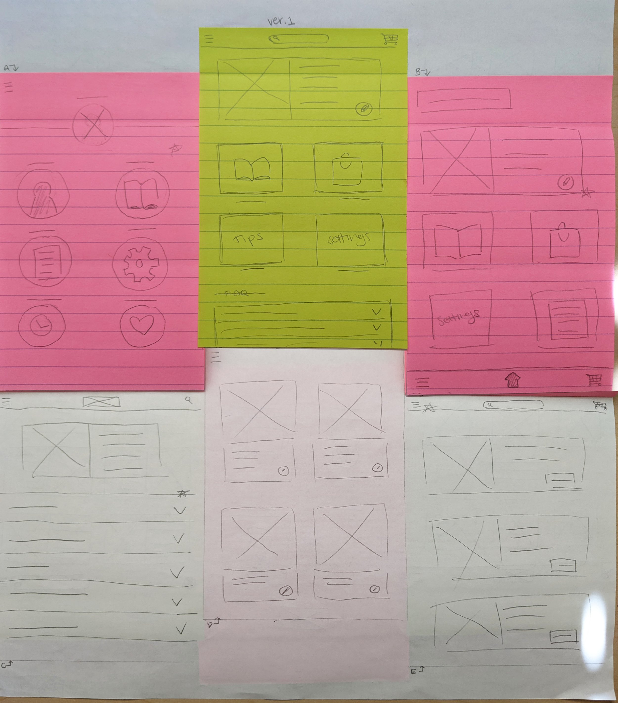
Paper wireframes
Taking the time to draft different iterations of each screen of the app onto paper ensured the elements that made it to digital wireframes would be well-suited to address user pain points.
For the address book, I prioritized a simplified, succinct layout to help users save time and reduce the amount of information on the page.
Digital low fidelity wireframes
As the initial design phase continued, I based each screen layout and design on its respective feedback and findings from the user research.
Low-fidelity prototype
I created a low-fidelity prototype from the completed digital wireframes. The primary user flow (the middle row of frames) is completing a bouquet order through an address book entry so the prototype could be used in a usability study.
You can view the low-fidelity prototype here.
Usability Study
I conducted two rounds of moderated usability studies. Findings from the first study helped guide the designs, from the wireframes to the first set of mockups. The second study used a high-fidelity prototype and it revealed which aspects needed more refining.
-
Users were confused by the lack of information on some pages
Users liked page layouts that felt familiar to apps they’ve used before\
Users wanted more search filters
-
The address book entry recommendations were confusing
Parts of the checkout process felt repetitive
The color palette has too many colors
Refining the Design
Mockups
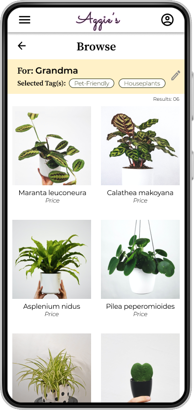
After the usability study, I added the “back” arrow to allow the user to move backwards in the flow (return to a previous page). I also decreased the number of products showing at once on the screen to allow more whitespace, breaking up the design a bit more.
The second usability study also revealed some confusion during the checkout process (not pictured here). I split the delivery options for more clarity. Now, users can decided between have their order delivered as soon as possible or choosing a future date for it to be delivered.


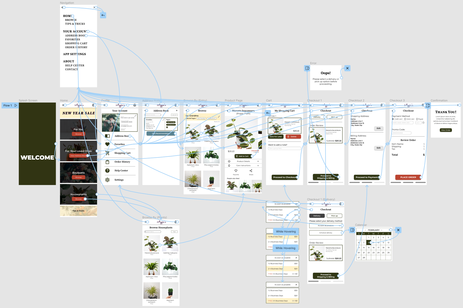
High-fidelity prototype
The final high-fidelity prototype presented a cleaner, more intuitive user flow. I also added a splash screen and some screens for error messages.
You can view the high-fidelity prototype here.
Accessibility Considerations
Used icons to help make navigation easier
Ensured the color palette passed the contrast checker
Included information hierarchy
Plan to add alternative text to all images for screen readers
Going Forward…
Takeaways
What I learned:
I shouldn’t be precious with my first ideas because as I received more and more feedback, it is only natural that aspects of the design will need to change.
Conducting usability studies and receiving peer feedback is extremely important, as each finding can lead to bigger themes. These themes then influence different iterations of the app’s design
“I would definitely use this app to buy flowers for my grandmother! I like that I can set up a recipient entry with search filters, so I won’t have to waste time searching every time the holidays roll around.””
Next Steps:
Conduct another round of usability studies focused on a broader range of users to ensure accessibility and other needs are met
Conduct another round of usability studies to validate whether all pain points have been effectively addressed
Conduct further user research to determine any new areas of need or gaps in the market
Let’s connect!
Thank you for your time! If you’d like to get in touch, follow the link to my contact information:


